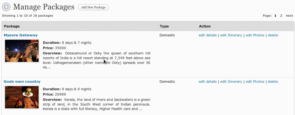
We have come up with a very intuitive dashboard for Bizkaro. The initial users of the product are very much impressed by the ease in using the dashboard. The dashboard is used to manage the content on the website.
I’ll give you a quick overview of the dashboard.
 All the available functionalities are nicely displayed on the left side of the screen. The functionalities are put into different categories for the ease of finding them quickly.
The right side of the screen is dedicated to display the actual content management forms. We have designed the flow (for adding new packages, adding new clients information etc.) very beautifully so that the user finds it very intuitive.
The header bar at the top displays the logged in user information and contains a link to go to the actual website.
We believe the users will find this UI interesting and easy to use. We look for your valuable feedback.
